Inspire the world to live life by bike.

Rapha’s Mission

Role of E-Commerce

Enable cyclists to find products that fit their cycling lifestyle.

The PDP (product detail page) is Rapha’s most important page, it’s where customers learn about each product, and make their purchase decision.

The page had remained the same for a 4 year period, so when the time came to explore a redesign, we had many years worth of feedback to factor in.

As well as our own internal UX frustrations with the page, there were new business requirements to cater for, and insightful comments & observations gathered from multiple rounds of user testing that we wanted to explore.

Considerations:
Rapha’s Customers

Rapha sells directly to customers all over the world. The website is translated into 7 different languages, with core markets being the UK, the US, Germany and Japan.

The most common customers are male, aged 35 – 45, and are split into 5 key personas:

Considerations:
Device Types

We reviewed all of our website traffic for the previous 12 months. Although visitors came from a range of devices and screen sizes, the overwhelming majority of revenue was taken from the desktop experience of rapha.cc

This suggested that desktop should be our focus, but also indicated that there was a huge opportunity with mobile customers.

Considerations:
Product Tiers

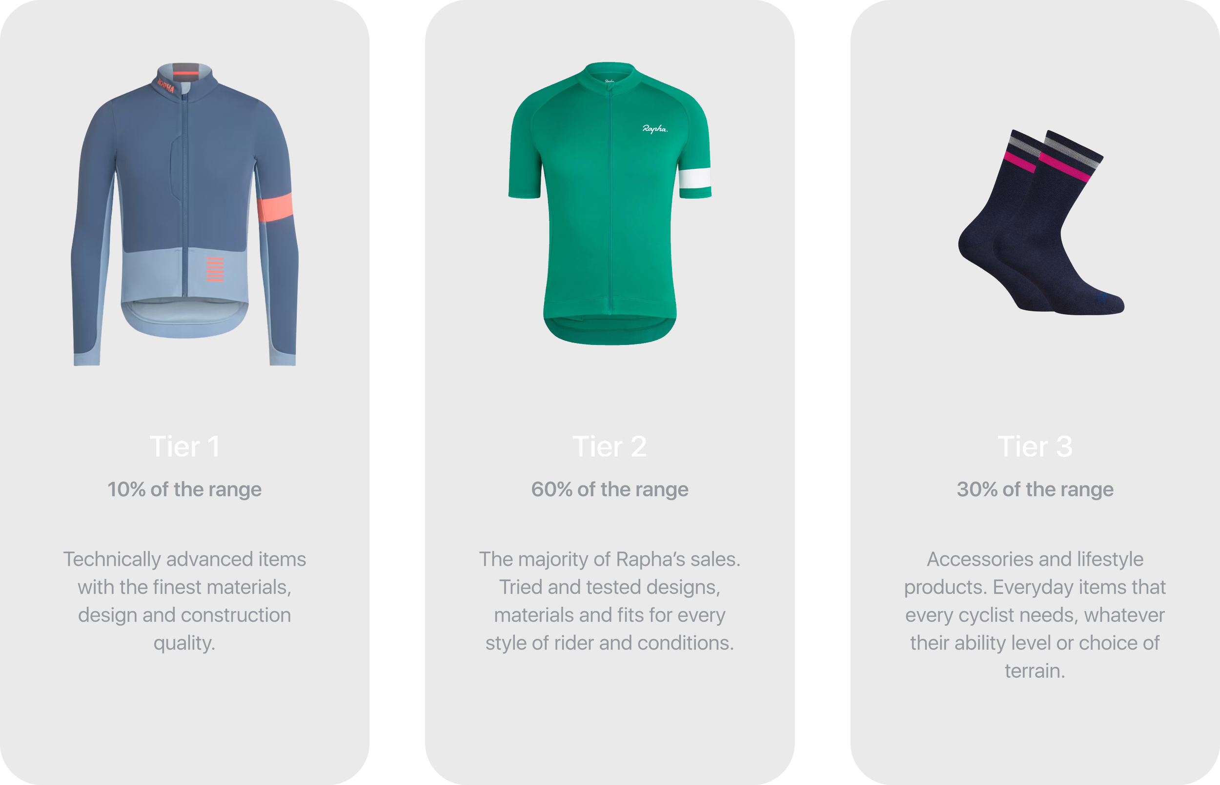
The Rapha product range is split into 3 tiers. Tier 1 products are the most expensive items, and account for 10% of the offering (e.g. waterproof jackets). These items usually have marketing campaign assets, as well as studio photography and video. Tier 3 products are the least expensive items (socks) and have less assets and written information associated with them.

A new PDP design had to flex and cater for all 3 product tiers.

I was tasked with translating 4 years worth of feedback and data into a suitable design solution that we could test. The test would include a subset of every market and customer, and incorporate every product tier.

I began by pulling all of the comments and requirements together into a list of potential action items, and then collaborated with the team to agree on priorities. The list was extensive, and outlined below.

The old PDP

User testing feedback & observations

There are too many galleries. Customers have to keep scrolling up and down to get an idea of what the product looks like.

The image selection isn’t great, it’s hard to see the product properly and know which item is the focus.

Arrangement of content isn’t an optimal use of space, and forces customers to scroll up and down between the functional UI and related product images.

Using image carousels means that images are hidden and customers have to click multiple times to see the product from all angles.

Add to wish list links, size guide links and reviews aren’t prominent enough and are easily missed.

Available sizes are hidden in a drop down selector.

Multiple carousels cause friction and frustration.

No layout solution for when a product doesn’t have enough reviews or Q&A.

Session cam heat map shows that the variant selector is the module that users interact with most.

Macro images of product details play a big part in purchase decision making, but currently sit at the bottom of the page.

Business requirements

We’d like to be able to add portrait and landscape videos from our studio shoots.

We’d like to be able to seamlessly integrate content from our marketing campaigns.

We’d like to be able to include different styles of photography in the mannequin carousel.

Is there a way to include a list of key product features higher up the page?

We’d like to integrate promotional messaging for offers or free shipping and returns.

How can we make tier 1 products look more premium than tier 3?

I explored multiple layouts and directions that would enable me to incorporate all of the requirements – additionally finding ways to create a design that would cater for all 3 product tiers.

The most notable change was the introduction of a single gallery that could handle multiple layouts of images and videos. The image selection was improved by employing a dedicated asset list per item – showcasing key product angles, on-body photography, macro detail shots and on-location shots of the products in use. Areas for both landscape and portrait format video from the studio or on-location shoots were also incorporated into the design.

The variant selector had a layout change, allowing important UI to sit closer to the product photography. This change also enabled better positioning of crucial functions such as size guide links, review links and the add to wish list button.

Key features and top selling points were now listed nearer the top of the page, with the remaining written content sitting together in a subtly refined bottom section.

Flexible gallery space

The wireframes below demonstrate how the new gallery space could flex to accommodate different asset lists, including multiple image ratios, video orientations and the 3 product tiers.

After a test period of 3 months, we saw positive metrics across all locales, and on both desktop and mobile vs. the control.

Some of the test result figures were truly astounding. With a 60.2% increase in add to wish list clicks on desktop, and 59.9% improvement in the fit and sizing engagement on mobile.

These metrics were attributed to a better overall layout, with key UI easier to find, and better product presentation, making the items more desirable.

The new design was implemented as a permanent change to rapha.cc

My role and responsibilities

The PDP redesign was just one project from my time at Rapha. As the sole digital product designer in the business, I produced all UX and UI design for Rapha.cc – ranging from functional changes to larger re-designs, leveraging site metrics, A/B tests and user testing.

I worked on user journeys, interaction, brand aesthetic and business requirements, seeking to continually evolve the design language in line with the larger brand voice, and deliver an experience that enabled cyclists to find the right product for their cycling lifestyle.

In the 7 year period I spent evolving Rapha’s digital experience, I supported all digital design and experience initiatives, helping it grow from a £50million business to a £100million business.